
Terminal
Interactive preview
Try Terminal
Plugins are not applied in this preview, so it may differ slightly from your published site.
Theme settings
Overview
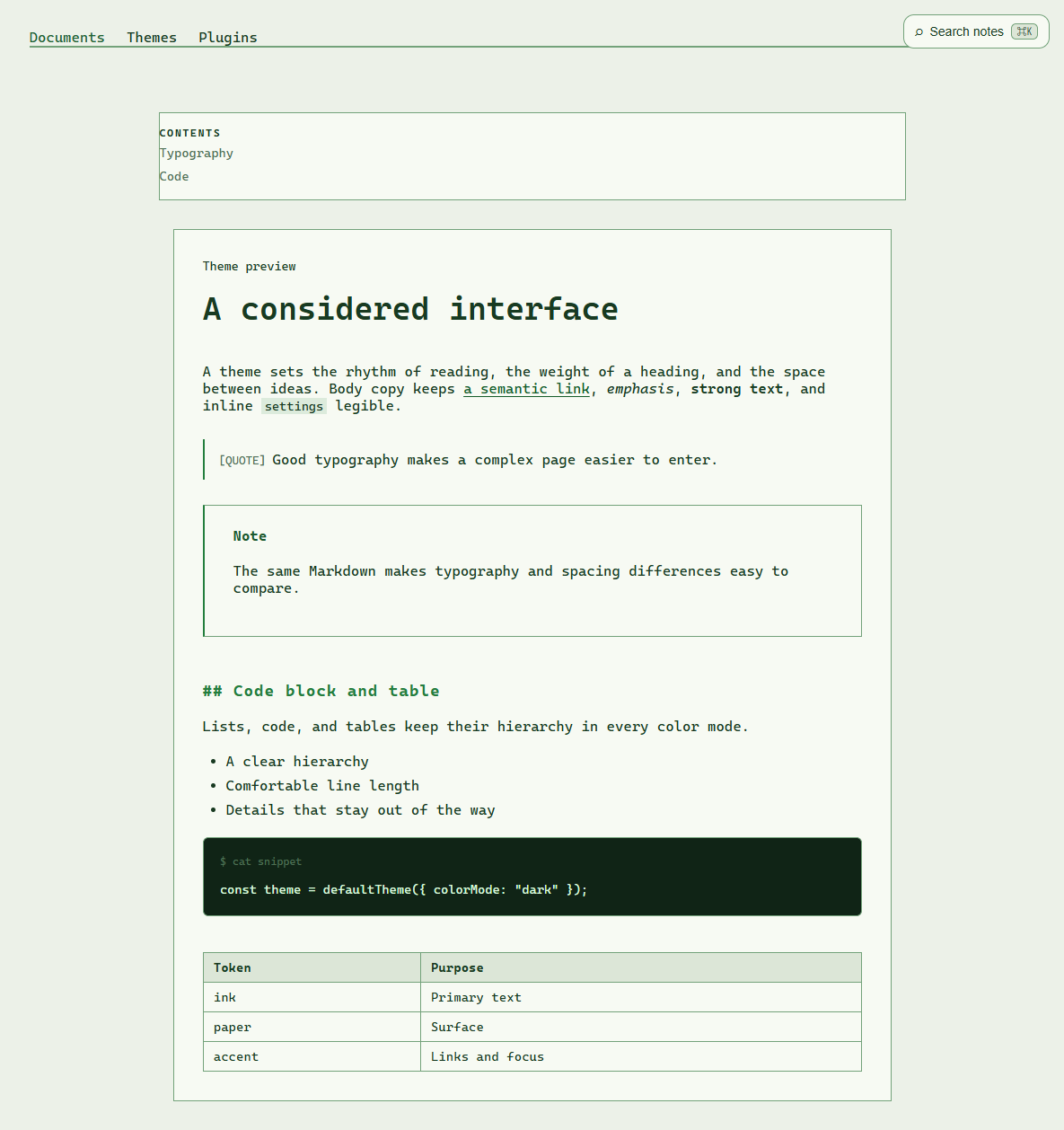
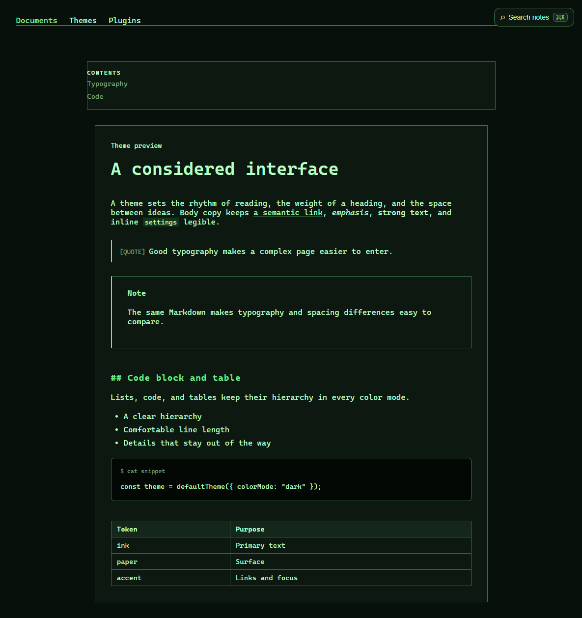
@riebeckite/theme-terminal provides the official Terminal theme. Its theme identity is terminal. A terminal-inspired theme with configurable phosphor and frame details.
Rendered example
Light
Dark
Installation
npm install @riebeckite/theme-terminalUsage
import { defineConfig } from "@riebeckite/core";
import { terminalTheme } from "@riebeckite/theme-terminal";

export default defineConfig({
  theme: terminalTheme({
    colorMode: "system",
    preset: "classic",
    settings: { typography: "mono" },
  }),
});
Common options
| Property | Values | Description |
|---|---|---|
colorMode |
"light", "dark", "system" |
Chooses the color mode. "system" follows the browser preference. |
layout |
"article", "sidebar", "full-width" |
Chooses the page layout. |
preset |
classic, amber, modern |
Applies a named set of theme settings before explicit settings. |
settings |
object | Overrides the settings listed below. Unknown keys and invalid values are rejected. |
stylesheets |
string array | Loads site-owned stylesheets after the theme CSS. |
Resolution order is schema defaults, then the selected preset, then explicit settings.
Theme settings
| Property | Type | Default and allowed values | Effect |
|---|---|---|---|
typography |
select | "mono" — mono, system, serif, sans |
Selects the article typeface. |
fontSize |
slider | 0.95 — 0.85–1.25, step 0.05 |
Article text size in rem. |
lineHeight |
slider | 1.75 — 1.5–2.1, step 0.05 |
Article line height. |
phosphor |
select | "green" — green, amber, white, ice |
Selects the terminal phosphor color. |
scanlines |
boolean | false |
Shows a subtle CRT scanline overlay. |
glow |
boolean | false |
Adds a glow effect to theme details. |
frameStyle |
select | "line" — none, line, window |
Selects the terminal frame style. |
cursor |
boolean | true |
Shows the terminal cursor. |
Presets
| Preset | Label | Applied settings |
|---|---|---|
classic |
Classic | { phosphor: "green", frameStyle: "line", cursor: true } |
amber |
Amber | { phosphor: "amber", glow: true, frameStyle: "window" } |
modern |
Modern | { phosphor: "ice", frameStyle: "none", cursor: false } |
CSS and attributes
The root receives data-rb-theme="terminal", data-rb-mode for an explicit light or dark mode, and data-rb-layout. Every setting is reflected as data-rb-setting-<name>; color, number, and slider settings are also available as safe --rb-setting-<name> custom properties.
See also
Theme API and Writing a theme.