
Image Compare
Before/after image sliders from a fenced image-compare block. The slider is
rendered at build time and enhanced by a small client script; without
JavaScript the same two images remain readable side by side.
Overview
```image-compare
before: ./before.png
after: ../assets/after.png
beforeAlt: Draft
afterAlt: Published
orientation: horizontal
label: Home page
```
before and after are required. Image paths resolve relative to the note,
using the same rules as Markdown images. External URLs, protocol-relative URLs,
and paths that escape the content directory are rejected.
The block becomes a <figure> with a native range input. Mouse, touch, and
keyboard all work through that input. Multiple blocks can appear on one page,
and SPA navigation removes each slider's listener when its page is replaced.
Usage
import { defineConfig } from "@riebeckite/core";
import { imageCompare } from "@riebeckite/plugin-image-compare";

export default defineConfig({
  // ...
  plugins: [imageCompare()],
});
The plugin registers its own stylesheet and page-scoped client entry. Nothing is emitted when the plugin is disabled.
Options
| Option | Type | Default | Description |
|---|---|---|---|
language |
string |
"image-compare" |
Fenced code block language |
Block fields
| Field | Type | Default | Description |
|---|---|---|---|
before |
string |
Required | Before image path |
after |
string |
Required | After image path |
beforeAlt |
string |
"Before" |
Before image alternative text |
afterAlt |
string |
"After" |
After image alternative text |
orientation |
"horizontal" | "vertical" |
"horizontal" |
Slider axis |
label |
string |
- | Caption below the comparison |
Example
```image-compare
---
before: ../../assets/themes/theme-default-light.png
after: ../../assets/themes/theme-default-dark.png
beforeAlt: Default theme in light mode
afterAlt: Default theme in dark mode
label: Default theme, light to dark
---
```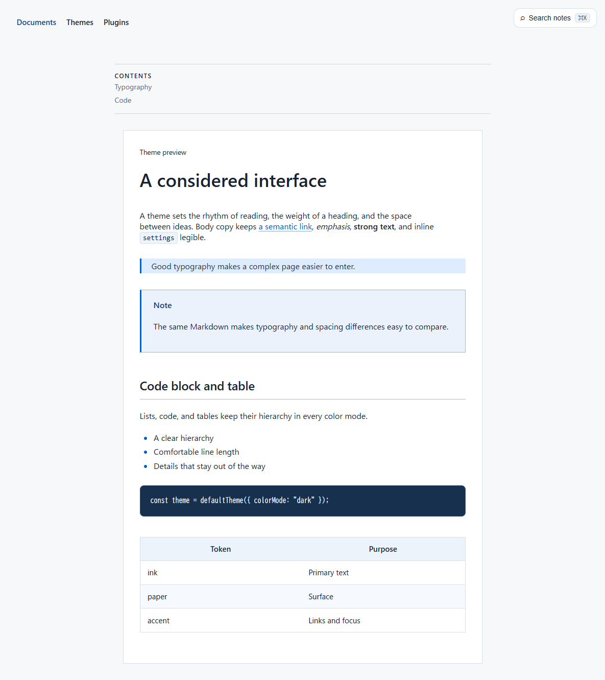 Before
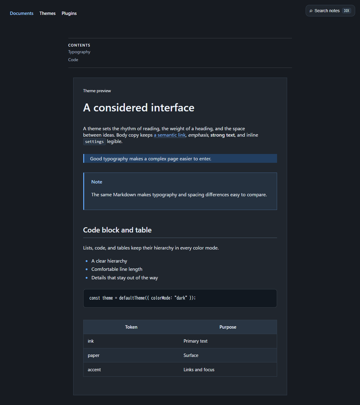 AfterBeforeAfter
Output and accessibility
The static figure lists both images with visible Before and After labels. When
JavaScript runs, the plugin hides the static list and exposes the interactive
stage. The range input covers the stage, keeps its native keyboard behavior,
and shows a focus outline on the stage. The after image is clipped with
clip-path, so neither image is repositioned or rescaled while dragging. Each
image keeps its natural aspect ratio and the stage grows to the taller image.
Give both screenshots the same width so their content lines up at the split;
different heights are fine.
Styles use the existing --rb-color-* theme tokens and work in Default, Light,
and Dark themes. No gradients, glass effects, excessive rounding, or animations
are used.
Diagnostics
| Code | Severity | Meaning |
|---|---|---|
image-compare-invalid |
error |
The block is malformed, an image is missing, or an image path is not supported. The block is replaced by an error box |